
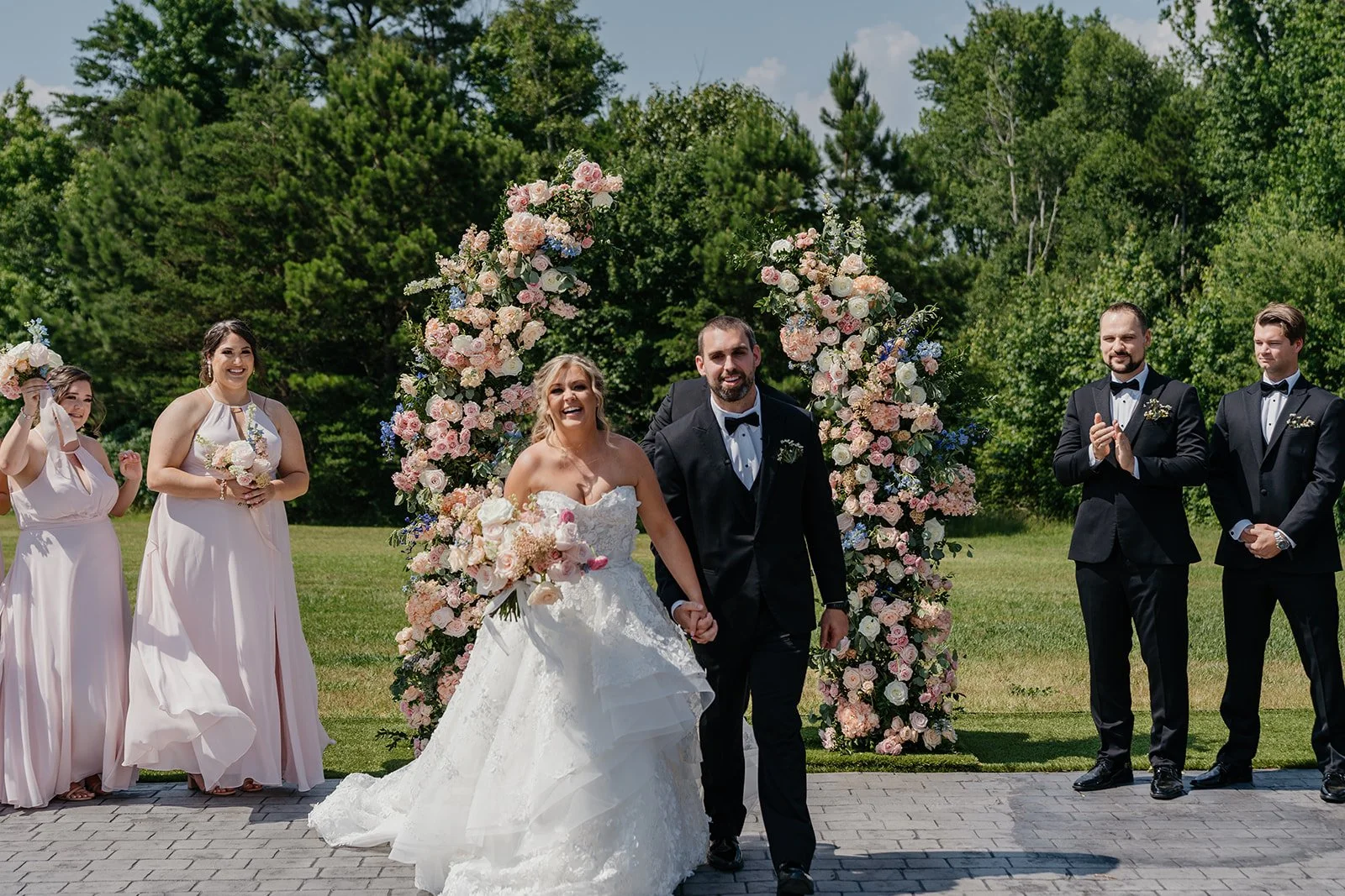
Choosing your wedding colors is one of the first design decisions you'll make.
Maybe you've been saving Pinterest inspiration for years. Maybe you love a particular shade of green. Or maybe you're trying to figure out which bridesmaid dresses will look best against your venue.
Here's something I wish more couples knew:
The colors that look beautiful on a Pinterest mood board don't always look the same in wedding photographs.
That's because wedding photography isn't just about the colors you choose. It's about how those colors interact with light, your surroundings, skin tones, and each other.
As a wedding photographer, I love when couples choose a wedding palette that reflects their personalities. But there are a few things worth considering if you want those colors to photograph beautifully.
Start With Your Wedding Venue, Not a Pinterest Trend
Before deciding on a color palette, look at the space where you're getting married.
Your venue already has a color palette of its own.
A historic ballroom might feature dark wood, gold accents, and warm lighting.
A garden venue might have green foliage, colorful flowers, and natural stone.
A modern venue might feature white walls, black details, and neutral architecture.
Your wedding colors don't need to match the venue exactly. They should complement it.
For example, deep burgundy flowers can look beautiful against a neutral stone building. Soft blues can create an elegant contrast with warm wood.
The important thing is understanding what will already be visible in your photographs.
The Best Wedding Colors Aren't Necessarily Neutral
There's a common belief that neutral weddings photograph better than colorful weddings.
I don't agree.
Neutrals can be beautiful, but so can bold, saturated colors.
I've seen how a strong color can become a beautiful part of a photograph when it's used intentionally.
The real question isn't whether a color is trendy or timeless.
It's whether the colors work together and allow the people in the photograph to remain the focus.
A colorful wedding can feel just as elegant as an all-white wedding.
Five Wedding Color Palettes That Photograph Beautifully
These are examples, not rules. The best palette is ultimately one you genuinely love.
1. Sage Green, Ivory, and Champagne
A soft, natural combination that works particularly well with gardens, outdoor estates, and greenery.
Sage green provides gentle contrast against ivory dresses and champagne accents.
It also works across different seasons.
2. Black, White, and Green
This palette creates a classic, high-contrast look.
Black bridesmaid dresses or suits can look particularly elegant against white florals and green foliage.
It can work beautifully in historic venues, ballrooms, and modern spaces.
3. Dusty Blue, Cream, and Soft Gold
Dusty blue can photograph beautifully against warm architecture and neutral settings.
The softer saturation gives the color presence without making it dominate every photograph.
It's an especially appealing option for spring and summer weddings.
4. Burgundy, Blush, and Ivory
For couples who love richer colors, burgundy adds depth while blush and ivory keep the overall palette balanced.
This combination can work particularly well in fall and winter.
5. Terracotta, Olive, and Cream
Earth tones can create a warm, natural aesthetic.
Terracotta and olive complement many outdoor settings, while cream helps prevent the palette from feeling overly dark.
Just remember that warm colors may appear even warmer under sunset light or amber indoor lighting.
How Bridesmaid Dress Colors Affect Your Wedding Photos
Your bridesmaid dresses are one of the largest areas of color in many wedding photographs.
Think about a wedding-party portrait.
You might have six or eight people standing together, all wearing the same color.
That color becomes a major part of the image.
This doesn't mean you should avoid bright dresses.
It means the color deserves some consideration.
Dark bridesmaid dresses
Black, navy, emerald, and burgundy can create a sophisticated look.
However, dark fabrics may lose visible detail in dimly lit environments, especially when the background is also dark.
Good photography and lighting help, but the surroundings still matter.
Light bridesmaid dresses
Champagne, dusty blue, sage, and blush can create a softer overall appearance.
These colors often work well in natural light.
But very pale shades may appear similar to one another under certain lighting conditions.
Mismatched bridesmaid dresses
Mismatched dresses can photograph beautifully when the colors share a cohesive direction.
You don't necessarily need everyone in the exact same shade.
Instead, choose a coordinated palette with complementary tones and fabrics.
That can create more visual depth than a completely uniform lineup.
Pay Attention to Fabric, Not Just Color
Two dresses in the exact same shade can photograph differently.
Why?
Because fabric changes how light reflects.
Satin can create bright highlights.
Velvet absorbs more light and produces deeper tones.
Chiffon creates softer movement and texture.
Sequins and metallic fabrics reflect light more dramatically.
When selecting bridesmaid dresses, consider both the color and material.
If possible, look at fabric samples in daylight and indoor lighting before making a final decision.
Your Flowers Don't Have to Match Your Dresses
In fact, I often think it's more interesting when they don't.
Imagine bridesmaids wearing sage green dresses and carrying bouquets with ivory, blush, and subtle peach flowers.
The contrast helps the bouquets stand out.
If every element is exactly the same color, details can blend together.
A cohesive palette doesn't mean every item needs to match.
Think about complementary colors and visual balance instead.
How Lighting Changes Wedding Colors
This is one of the most important things to understand.
A color doesn't look identical under every light source.
Your bridesmaid dresses might look one way in a bridal boutique and another way during a candlelit reception.
Natural daylight
Daylight generally provides a useful reference for how colors appear, although shade, clouds, and reflected light can still change their appearance.
Golden hour
Sunset light adds warmth.
Cream, champagne, terracotta, and blush may appear warmer than they do in neutral daylight.
Indoor tungsten lighting
Warm chandeliers and traditional bulbs can introduce amber or yellow tones.
Colored uplighting
Purple, blue, pink, or red reception lighting can dramatically affect the appearance of clothing, flowers, and skin tones.
That's not necessarily a problem, but it's worth considering if accurate color representation matters to you.
Be Careful With Strong Colored Uplighting
Reception uplighting can make a room look incredible.
But there's a difference between adding atmosphere and covering every surface with saturated color.
For example, strong magenta lighting may cast pink tones onto faces, dresses, and white table linens.
Your photographer can use professional lighting techniques to manage some of those effects, but extremely saturated ambient lighting still influences the overall appearance.
If you love colorful uplighting, consider asking your DJ or lighting company whether certain parts of the reception can use softer, more neutral lighting.
That can be particularly helpful during formal dances and speeches.
Should You Avoid Bright Red, Orange, or Neon Colors?
Not necessarily.
Bold colors can make a wedding visually memorable.
But extremely saturated fabrics can reflect colored light onto nearby surfaces and skin.
This is especially noticeable in bright sunlight or when large areas of fabric sit close to someone's face.
If you love bright colors, don't abandon them simply because of photography.
Instead, consider using them intentionally.
For example, a bold floral palette can add energy while neutral clothing provides visual balance.
Consider the Season, But Don't Let It Decide Everything
Certain colors are traditionally associated with different seasons.
Spring often brings pastels.
Summer is associated with brighter colors.
Fall tends toward burgundy, rust, and earth tones.
Winter frequently features deep greens, navy, and black.
But those aren't requirements.
A black-and-white wedding can look beautiful in July.
A soft blue palette can work in December.
The most important thing is choosing colors that complement your venue and reflect your style.
Choosing Colors for Chattanooga and Nashville Weddings
One advantage of getting married in Tennessee is the variety of settings available.
Chattanooga weddings might feature mountain scenery, riverfront views, historic architecture, or wooded properties.
Nashville weddings might take place in elegant ballrooms, urban venues, or countryside estates.
Each setting creates a different visual backdrop.
For mountain weddings, consider how your colors will look against greenery, stone, and seasonal foliage.
For historic indoor venues, pay attention to warm wood tones and existing architectural details.
For modern venues, you may have more freedom to introduce bold colors because the surroundings are relatively neutral.
The venue should influence your choices without limiting your creativity.
Think About How Your Wedding Colors Will Age
Wedding trends change.
Certain colors become popular for a few years and then fade from Pinterest inspiration boards.
But I don't think that means you should avoid them.
If you genuinely love a particular color, that's a good reason to use it.
The problem comes when couples choose an entire wedding aesthetic simply because it's popular online.
Ask yourselves:
Would we still love this color palette if nobody else were using it?
If the answer is yes, you're probably making the right choice.
My Approach to Photographing Wedding Colors
One of my priorities as a wedding photographer is preserving natural-looking color.
I want your wedding photographs to reflect the atmosphere you created.
If you chose emerald bridesmaid dresses, I don't want them to look gray.
If your flowers were warm and colorful, I don't want the editing to remove their personality.
At the same time, every lighting environment requires adjustments.
An outdoor ceremony, indoor reception, and nighttime dance floor will naturally look different.
My goal is to create a cohesive gallery while maintaining realistic skin tones and the character of your wedding.
Frequently Asked Questions
What wedding colors photograph best?
There isn't one universally best palette. Sage green, dusty blue, burgundy, black, ivory, and earth tones can all photograph beautifully when they complement the venue, lighting, and surrounding colors.
Do dark bridesmaid dresses photograph well?
Yes. Black, navy, burgundy, and emerald dresses can look elegant in photographs. In darker environments, additional lighting may be needed to preserve detail and separation from the background.
Are mismatched bridesmaid dresses good for wedding photos?
They can be beautiful. Coordinated colors with different shades or textures can add visual interest while maintaining a cohesive wedding aesthetic.
Do wedding colors look different in professional photographs?
They can. Lighting, camera settings, surrounding colors, fabric texture, and editing all influence the final appearance. Professional photographers work to maintain consistent and natural-looking results.
Should wedding flowers match bridesmaid dresses?
Not necessarily. Complementary flowers often stand out more effectively than bouquets that perfectly match the dresses.
What wedding colors are timeless?
Neutral palettes, black and white, soft blues, greens, and rich classic tones often remain visually appealing over time. However, choosing colors that genuinely reflect your personalities is more important than following a supposedly timeless formula.
The Best Wedding Colors Are the Ones That Feel Like You
You don't need a perfectly neutral wedding to have timeless photographs.
And you don't need to follow the most popular Pinterest palette of the year.
Your wedding colors should reflect your personalities, complement your venue, and help create the atmosphere you want.
Photography should preserve those decisions beautifully—not dictate every detail.
At Spencer Purcell Films, I photograph and film weddings throughout Chattanooga, Nashville, and Tennessee with a focus on natural moments, thoughtful storytelling, and colors that remain true to the experience.
Planning Your Wedding in Chattanooga or Nashville?
If you're looking for photography and videography that capture your wedding's atmosphere, details, and genuine emotions, I'd love to hear what you're planning.
Contact Spencer Purcell Films to start planning your wedding coverage.